Gobee Bike
UI/UX Design, Graphic Design, Animations
What I can do with a Fiverr logo in less than 2 months.
Gobee Bike was a bike share startup in Hong Kong. It was a bold move to create such app in a highly dense city with one of the highest priced real estates. The company made headlines when the bikes were found trashed all over the city. The company unfortunately did not survive due to a series of negative press that includes security issues and unmanaged and abandoned bikes.
Make it look good. Without redesigning the fiverr bee logo.
Improve usability.
Gain back trust from the transaction security issue that made headlines.
Work with the team of developers that are busy working on more crucial issues than the frontend.
Hold back bitterness on what it could've been if things worked out.
Wireframe
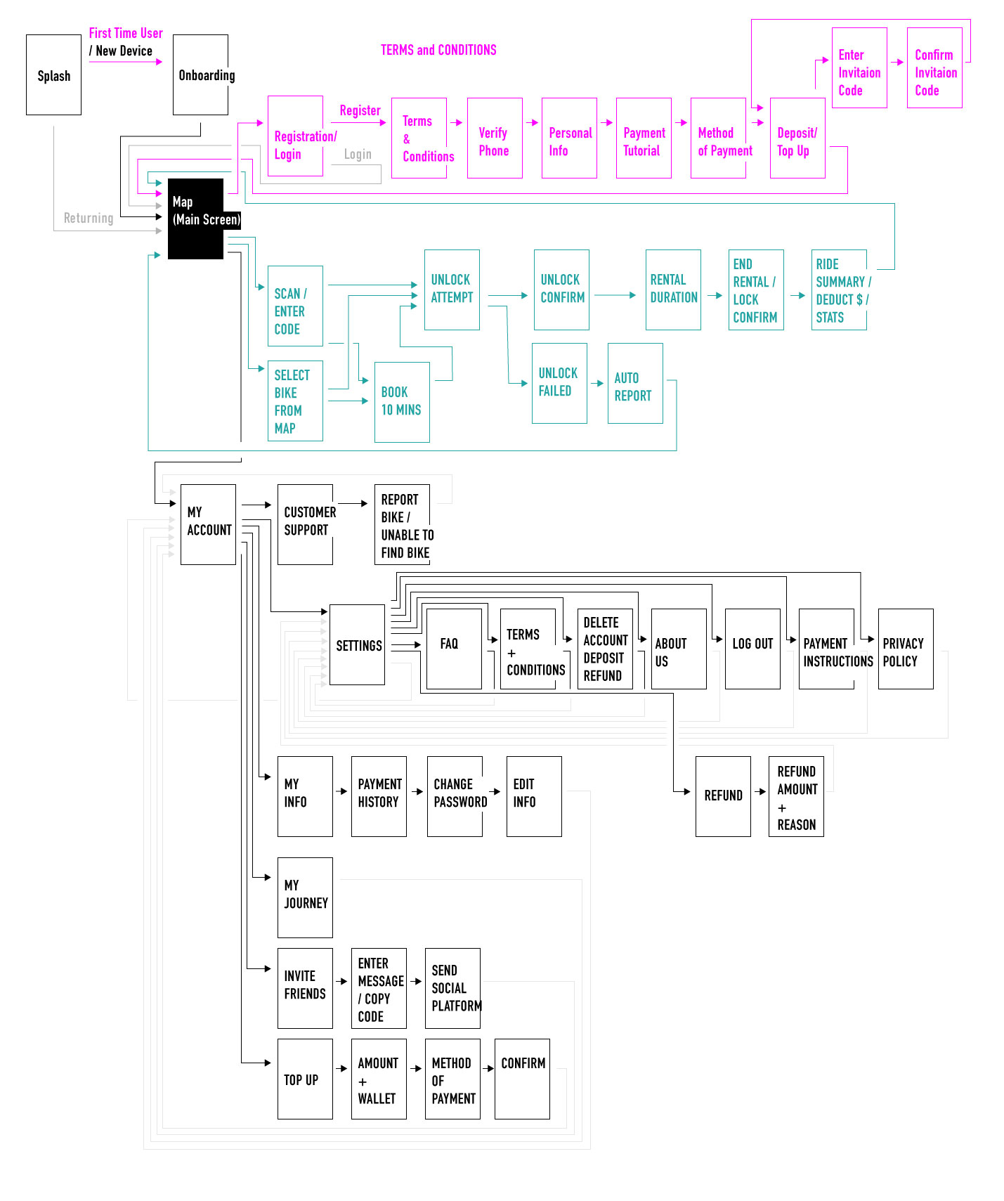
There were plenty of trial and error learning the process of using the app. There were a lot of functional issues with the state of the app while I was handling the project. I have laid out how the app will ideally function, and minimised and simplified the processes as much as possible.

CMS
This was the first time I have the opportunity to build a CMS to go along with the frontend. It was a great learning process to gain knowledge on the structures on the backend, as well as to think about the process of a person who needs to maintain the website. The website was build with Webflow, it wasn't a self built CMS, but there were still plenty of lessons learnt.
Handover
My contract was a 2 months period. The duration was not long enough for me to work with the development team for implementation. And my contract was not extended. I packaged everything I have done, and handed over brand guidelines and prototype files for the team to use. The company has then closed down less than a year later.
#60ff67
#21a3a3
#bebebe
#3a3d4d
Gobee's Primary Green based on the bike's and the existing logo's colour.
Secondary colour used to highlight elements in second tier of importance. This colour wants your attention, but isn't the focus.
Grey is used as a contrast to the bright green, a counter to it. When green means go, forward, or next, this grey means stop, backwards, or previous.
Charcoal purple is used when a darker colour is needed. This applies to background overlays of a popup message.
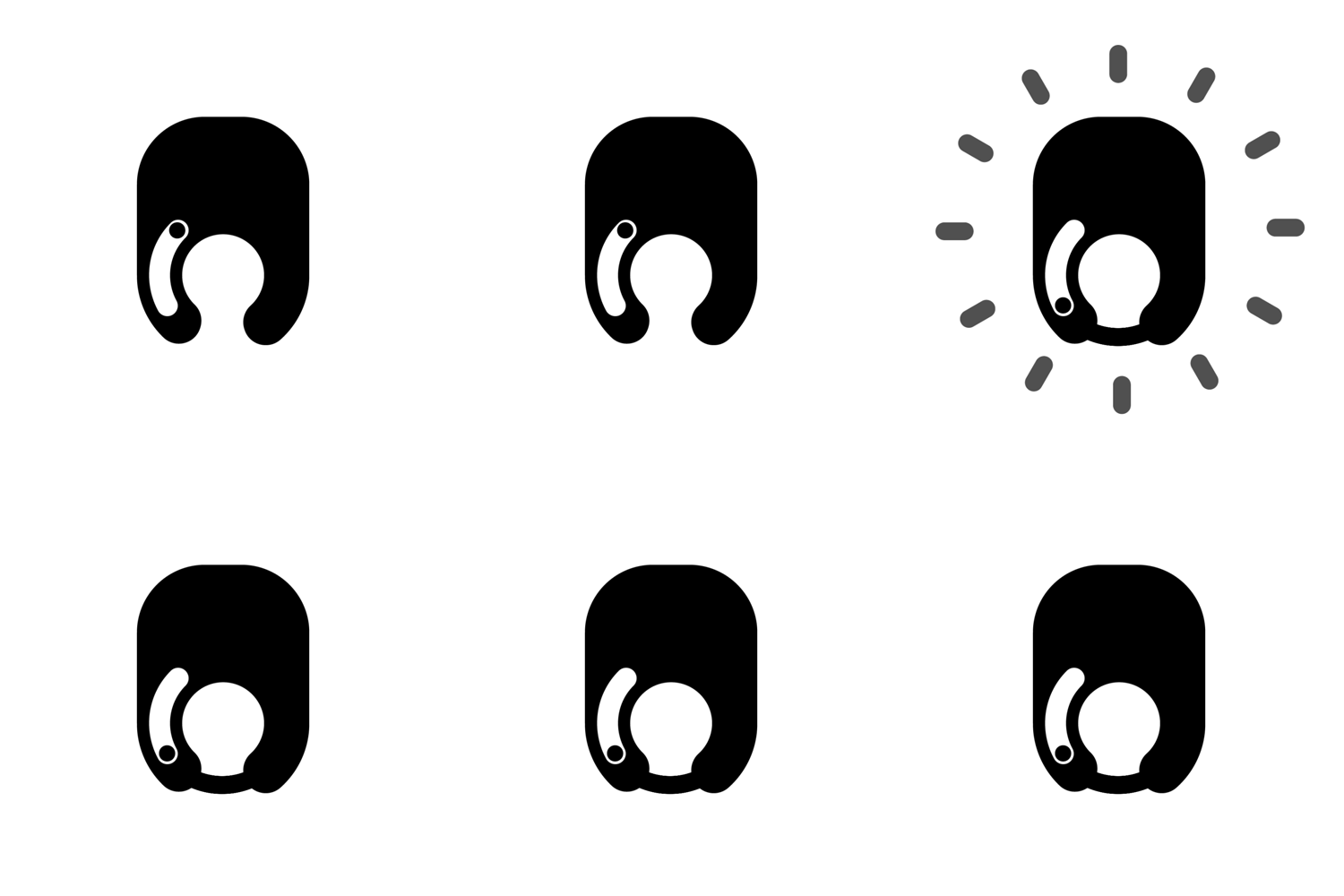
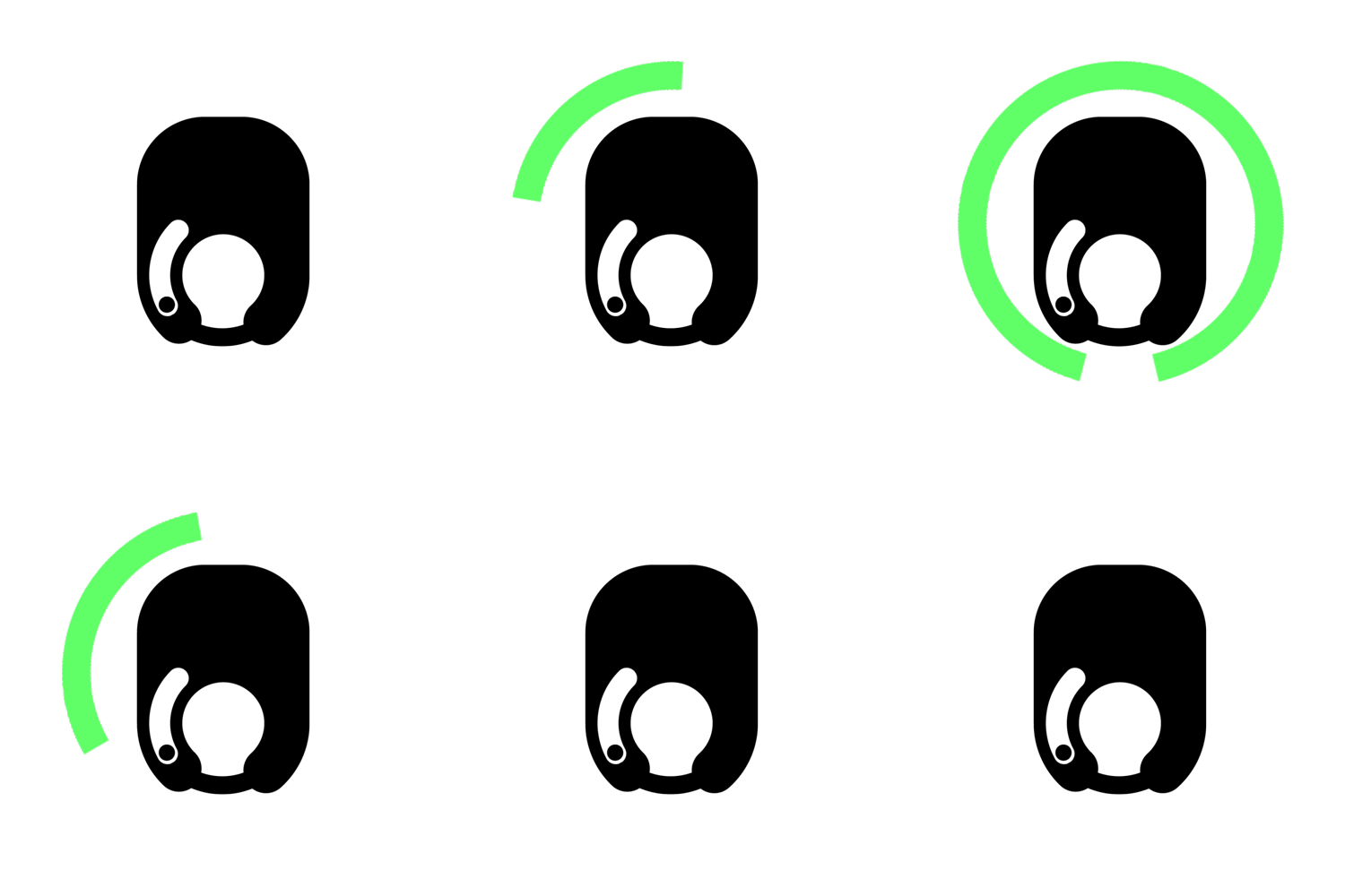
Making a shit logo less shitty by animating it.


UI Prototype
Adobe XD
There were plenty to learn from this project. I believe I had poor communications with the founders of GoBee Bike, I did not get good feedbacks, and I did not ask the right questions. I also did not give confidence to the team to believe in what I do. Also it was the first time I dealt with UX design research professionally, and there were plenty of improvements I could have made, like how to effectively present my work.
Go to asset handover page
Go to prototype (EN)
Go to prototype (繁體)