Gobee.bikeAPP UI
Graphical Elements
Fonts
DIN was used in the app mockups. If we decide to use this font, here is the link. It costs US$2,878.20 for the full font.A version that I have purchased have been uploaded on here. Note:There may be licensing issues if Gobee.bike doesn't purchase the font as an organization.
Yantramanav can be a free alternative, which is used on this site. Here is a Google Fonts link.
Colours
#60FF67
Gobee's Primary Green based on the bike's and the existing logo's colour.
#21A3A3
Secondary colour used to highlight elements in second tier of importance. This colour wants your attention, but isn't the focus.
#BEBEBE
Grey is used as a contrast to the bright green, a counter to it. When green means go, forward, or next, this grey means stop, backwards, or previous.
#3A3D4D
Charcoal purple is used when a darker colour is needed. This applies to background overlays of a popup message.
Graphical Elements
Hexagon Buttons
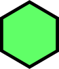
Resembles the beehive pattern. The hexagon is used primarily as buttons on the app.
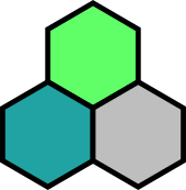
The hexagons can be stacked together along the black outline.
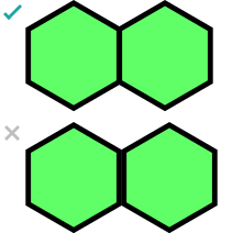
Do not align the hexagons at the edge of the shape. It will create a thick outline.
Animation
Locks
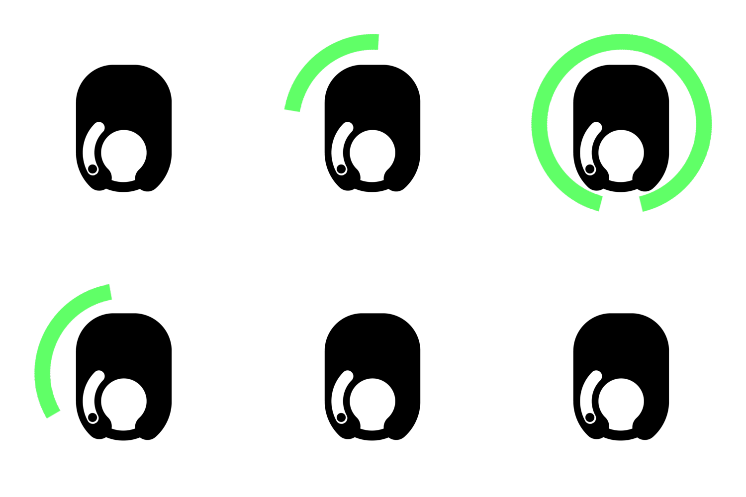
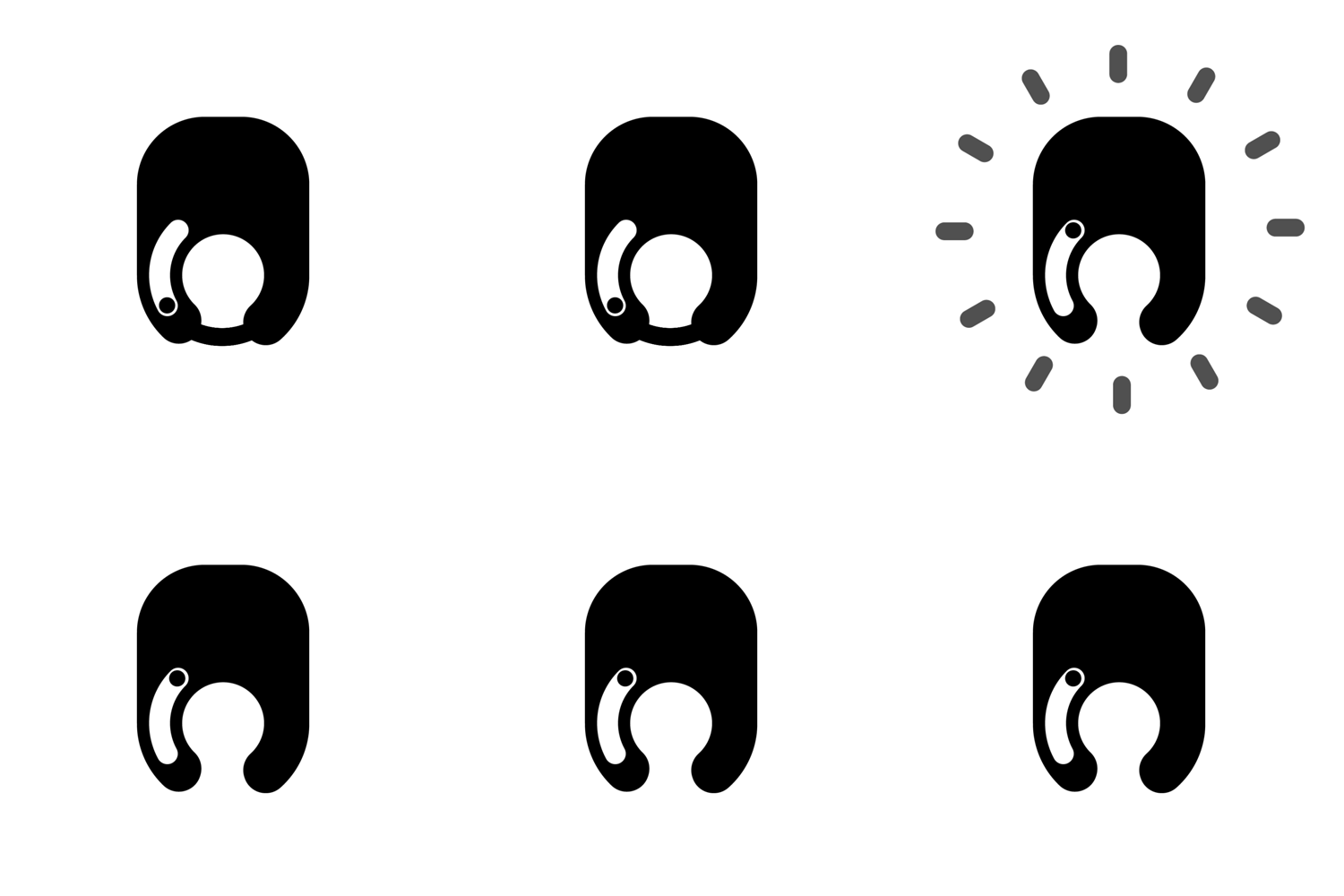
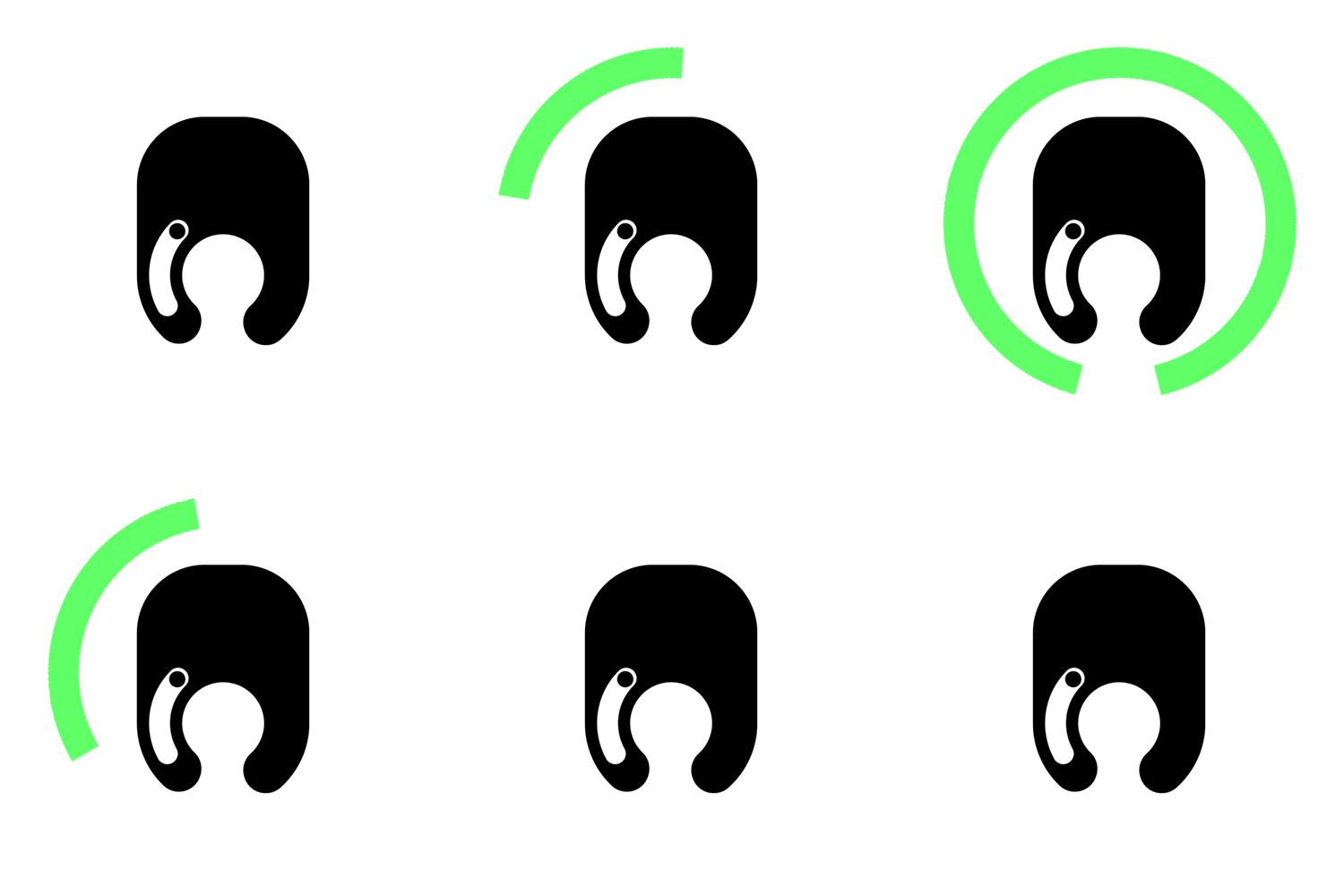
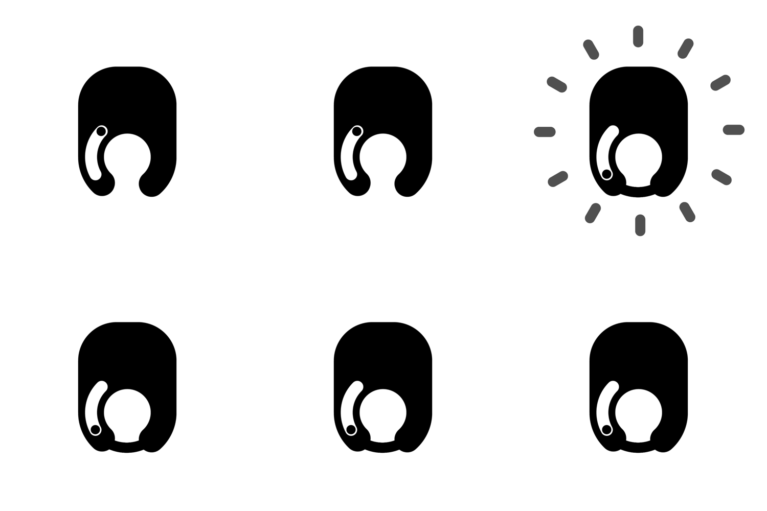
Indicates the status of the locks
Mockups
Interaction
Basic interaction on opening menu and bike menu on map